IBA Group Tableau Special Courses
Table of contents
Amid the rapid growth and development of the IT sphere, it is essential to find your niche: an area to dive in, develop competencies, and enjoy yourself in the process.
We at IBA Group are constantly developing our business intelligence (BI) and BI systems excellence. Through BI Lab, established 2012, professional BI developers and business analysts hold specialized courses annually for interested students. Launching laboratories and working with students helps us keep our employees in shape, stimulate them to new professional achievements, and nurture new hires.
In the courses, students study new technologies, developing both a theoretical and practical basis for further work. Since the program’s inception, we have trained more than 200 specialists, each year focusing on different high-demand BI technologies, like IBM Cognos, Qlik Sense, SAP BO and more. This year, BI Lab took on the BI platform Tableau.
This was our Business Applications Department’s first experience conducting Tableau courses, not to mention our first experience conducting online courses. In past years, courses on BI technologies have always occurred in person.
Why did we choose Tableau this year? For a number of reasons:
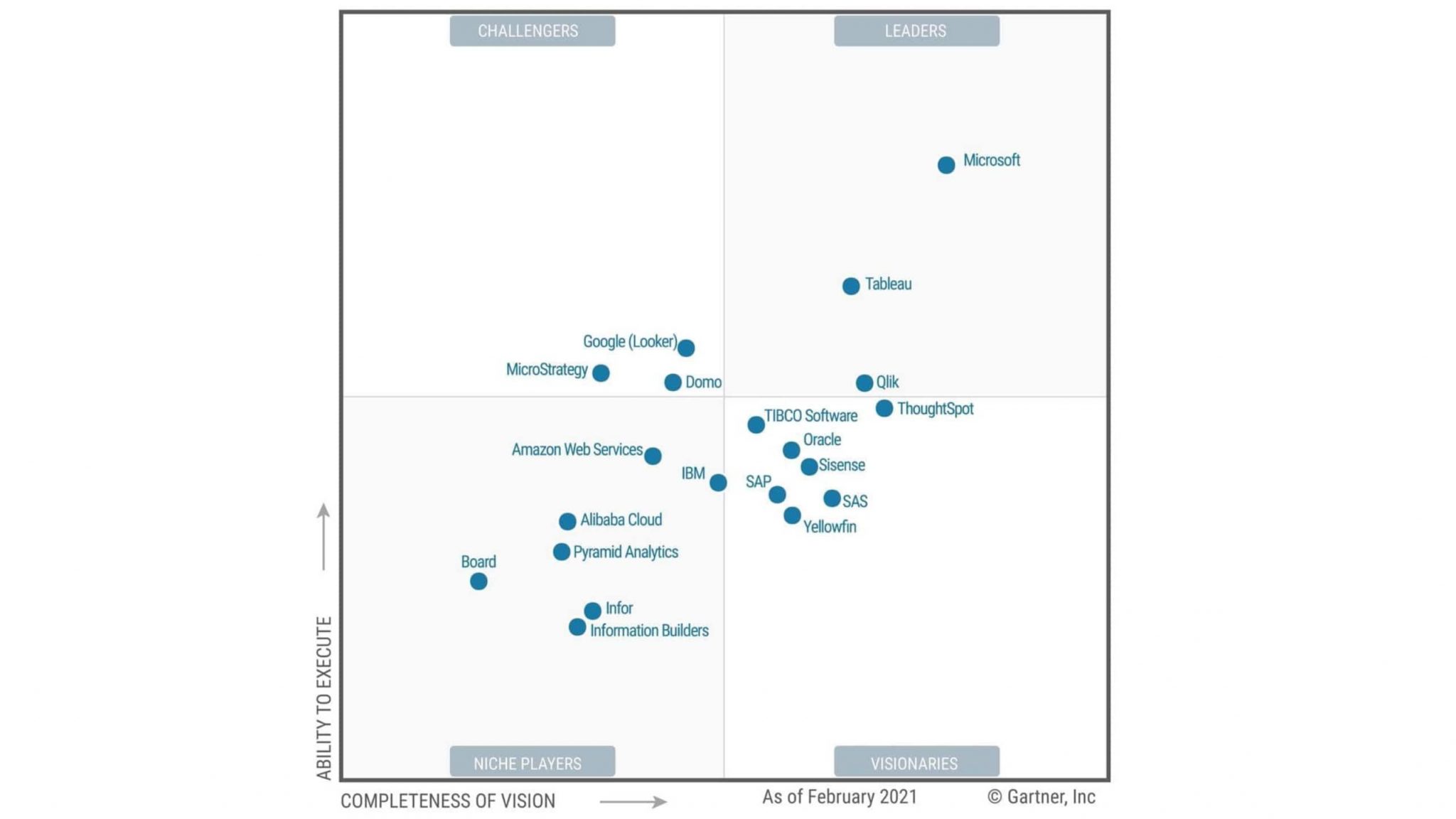
- Tableau is one of the best BI systems on the market — Gartner has featured it on its list of best BI systems every year since 2013 (see graphic below)
- It can be accessed conveniently from any device
- It offers a rich selection of data visualization tools Tableau automatically determines data structure, and selects the best visualization by default
- It combines richness and simplicity for interactive information analysis
Through quarterly releases, it evolves dynamically - It has the most active user community of any BI system Tableau provides interesting dynamic reports
- According to a 2020 vote among members of our Business Applications Department, it is our developers’ favorite BI system
- We have been using the platform since 2011, have been a service partner since 2019, and have been a bronze-level reseller since 2021
During BI Lab courses, students receive all necessary knowledge for future work on real projects. Upon completing a course, students can immediately begin benefiting their companies. Employees who started their careers with BI Lab stand out for their dedication, efficiency, and desire to get acquainted with new technologies and BI products. They develop rapidly and often grow professionally within the IBA ecosystem.
BI Lab 2021: Tableau
From March to May 2021, BI Lab hosted the online course, “Tableau Basics — Data Visualization and Analysis, Tableau.” The course was aimed at students who had just begun using BI platforms and wanted to deepen their knowledge of business analysis through studying modern visualization tools.
Over the course of two weeks in mid-March, we conducted a series of interviews with undergraduate IT students. Qualified applicants needed a good technical understanding, a good knowledge of the basics of DB and DWH, and the ability to write SQL queries. They also needed an English level of at least B1 (part of the interview was conducted in English). After the interviews, 12 of the most worthy, purposeful students were selected for the course.
Because the Tableau course was new, instructors had to prepare lecture materials from scratch — a hefty task. We used materials from a broad range of sources to prepare lectures. First and foremost, we used the official Tableau website and their excellent theoretical base. We could answer almost any question here. We also used video materials from this website and generated a workbook to consolidate all materials. We also used other training resources — like udemy.com and DataYoga — to prepare lectures.
A big plus during the courses were the theoretical questions lecturers asked students to test their knowledge. The lecturers assessed the students’ answers, and then met to rate each student, identifying whom they should invite to work with IBA in the future. Twice during the course, students were given homework with practical assignments. Lecturers carefully checked the homework, then later provided professional comments and analyzed common errors.
The courses focused on basic Tableau Desktop skills, like:
- Loading and processing data from different sources, and setting up communication between them
- Analyzing indicators, assessing the accuracy of forecasts, and making strategic decisions based on the data obtained
- Building user-friendly dashboards and interactive charts in Tableau Desktop using the principles of effective visualization
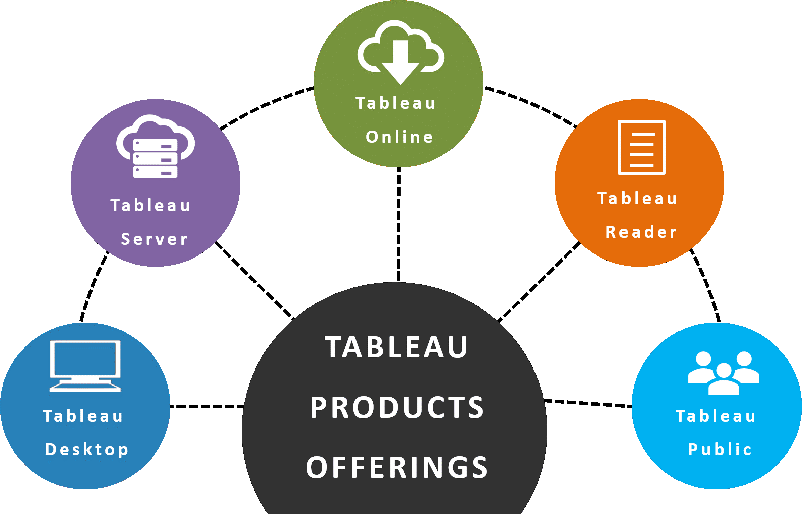
In addition to Tableau Desktop, students developed hands-on experience with a range of other Tableau products, including Tableau Public, Tableau Reader, Tableau Server, Tableau Online, Tableau Mobile, and Tableau Prep.
Not all students who took the courses performed excellently. But they successfully completed homework assignments, listened attentively to lectures, and read additional course literature.
At the end of the courses were two exam hurdles. One was a test, analogous to a certification exam, that consisted of theoretical and practical tasks. The other required students to prepare their own projects, to be presented during the last lesson. The goal of each project was to create and publish Tableau visualizations on a topic of interest using any data source. Students had to analyze the selected dataset, find problem areas requiring in-depth analysis, create suitable visualizations, and save the final dashboards to Tableau Public.
Students presented work on a wide variety of topics. Here are a few of the most interesting.
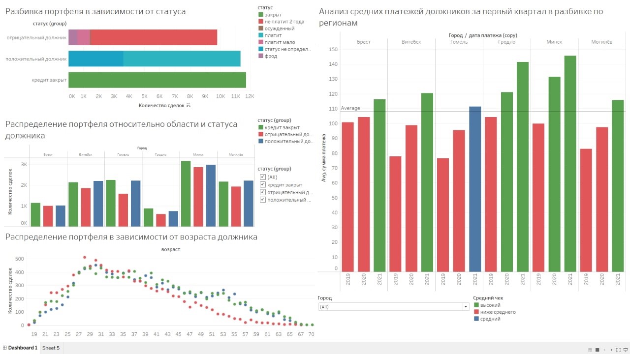
1. Banking Services
The purpose of this project was to analyze the current state of a loan portfolio consisting of obligatory debtors. For the analysis, the portfolio was divided into three groups of debtors:
- Debtors with repaid credit obligations
- Debtors who pay off debts in a timely fashion
- Debtors with whom it is necessary to take debt collection measures
A diagram helped demonstrate the relationship between paying and non-paying debtors for each of the regions. The dashboard contains a chart with information on the composition of age groups, reflecting credit history, as well as a chart with the dynamics of payments among regions and groups of debtors in the first quarters of 2019-2021.
The student took the data for this project from her current place of work, removing personal information about the payers from the source. Visualizations present information on any of the cities, as well as the status of debtors based on the analyzed data. It also helps to display positive dynamics and repayment of debts.
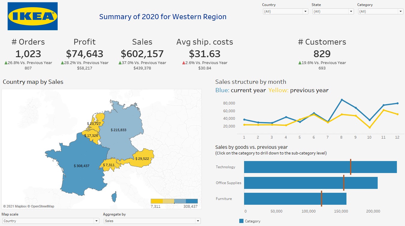
2. Business Development Analysis
The goal of this project was to conduct a comparative analysis and track the dynamics of key metrics for IKEA’s business development in Western Europe.
Thanks to a well-built dashboard, you can compare the values of KPI metrics for the current year to the previous one. You can also select the desired region and product category for a more detailed analysis. The student designed the interactive dashboard in IKEA’s corporate colors: yellow and blue.
The student used data from another retailer as the data source. Unfortunately, IKEA does not upload this kind of information to the network, but the student wanted to present a dashboard stylized specifically for IKEA.
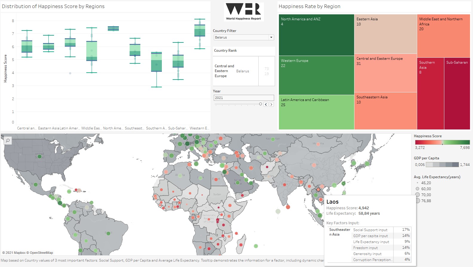
3. National Happiness Levels
The aim of this project was to study the methodology for calculating the happiness index in countries of the world, and then analyze the changes in these metrics for the period 2015-2021.
The World Happiness Report is a product of the UN’s Sustainable Development Solutions Network (SDSN). The SDSN aims to show the achievements of countries around the world in terms of their ability to provide residents with a happy life. A public opinion poll, in which residents self-report how happy they feel, comprised a large portion of the study. This poll is conducted annually by Gallup International, which invites respondents in each country to rate their feelings of happiness on a special scale.
Six objective factors are used to assess national happiness:
- GDP per capita
- Social support
- Life expectancy
- Freedom of citizens to independently make vital decisions
- Generosity
- Attitude toward corruption
Finland has ranked first since 2018.
The student built a dashboard to visualize the available data. The main feature of the dashboard was a map that allows users to simultaneously visualize geographic information and analyze several factors. The student’s analysis identified the countries with the highest level of happiness as the countries of Western Europe, North America, and Oceania. The countries with the lowest levels of happiness were in the African continent. The most unequal distribution of happiness was in the Middle East. You can also trace the general trend toward an increase in the level of happiness and note the main factors driving its increase: GDP growth, higher social support from the state, and rising life expectancy.
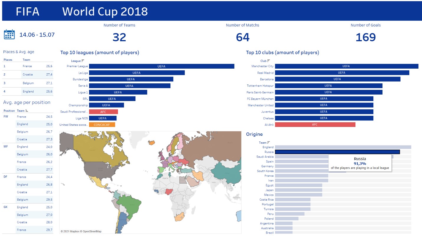
4. Sports Statistics
The goal of this project was to analyze the data of football clubs represented at the 2018 World Cup. The dashboard presented main KPIs: the number of teams, matches, and goals scored by the teams at the final stage. There was also a table that analyzes the average age of players from different teams and positions. There were top 10 leagues by the number of players, top 10 clubs, and corresponding confederations. Of particular interest was analyzing the percentage of players on a team who played in the national league of the same country they represent.
Visualization on the map showed the countries participating in the championship. Additionally, hovering over any of the countries highlights the corresponding information on other visualizations.
It is noteworthy that this project for the Football Championship was prepared by a young female student. The source she found was lacking some information, so she made an additional database conversion, including data on football leagues and confederations.
5. Entertainment Content
The goal of this project was to analyze the Netflix streaming platform to determine the relationships between data on the distribution of shows by country. The project also analyzed the most popular and productive directors and actors and general information about the platform’s content. Netflix data can be found in the public domain on the Internet.
Tableau’s capabilities made it possible to customize navigation between dashboards, which significantly relieved the dashboard and helped break down information into categories, improving its perception and analysis. The dashboard was also stylized to match Netflix’s color scheme. The student did a lot of work to achieve this harmonious design.
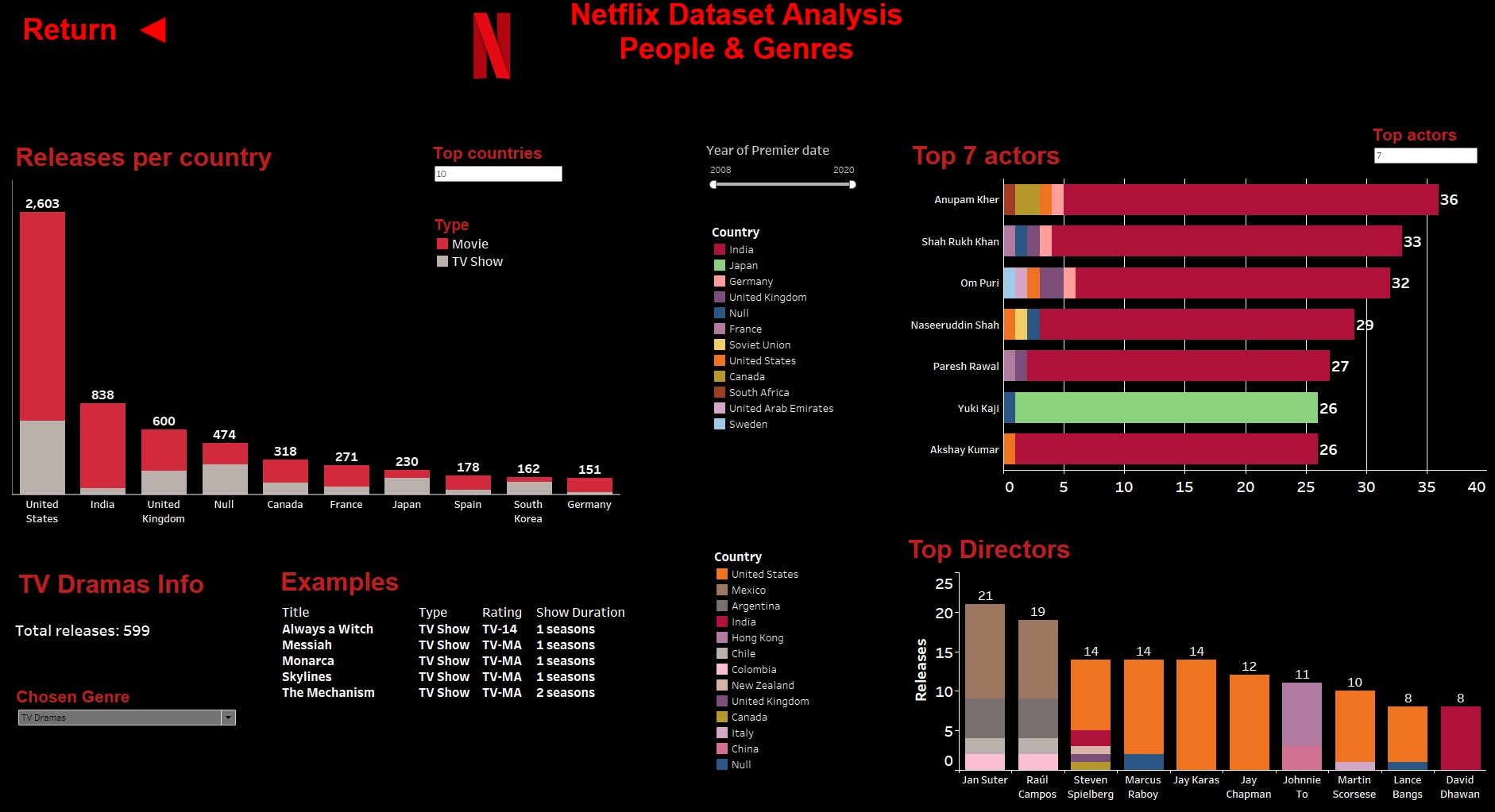
As a result, we can see that most TV shows — and, more starkly, films — have been released in the USA. TV shows are preferred in Southeast Asia (70% of the total volume of TV series). The most popular Netflix actors are Indians, mainly acting in drama and comedy genres. The most productive directors work in the USA and Mexico.
Conclusion
As you can see from these presentations, Tableau is a very flexible, informative BI tool. It allows users to analyze a variety of sectors, from as quantitative a realm as the financial sector to as qualitative an area as happiness. Tableau is a very powerful tool that helps solve a litany of business problems.
The certificates of completion for “Tableau Basics — Data Visualization and Analysis” course were presented in May 2021. Six out of 12 students got jobs with IBA, and on June 15, they became part of our friendly team.
The goal of studying a new product with which you intend to work is to obtain a professional certificate. Tableau offers a range of certifications. Through a combined approach during the courses, students receive all the knowledge they need to successfully pass the certification exam.
For example, to obtain the Tableau Desktop Certified Associate certificate, which our employees received, you must pass a test consisting of 36 questions: 18 theoretical, 18 practical. It’s a tricky test. To pass it, you must answer 75% of the questions correctly. At the moment, our employees have received four professional certificates.
We expect that some of the students we recruited to IBA after the Tableau courses will soon seek other certifications and become professionals in their fields. Let’s wish them good luck!

Testimonials from students

Before I joined the course, I had a very vague understanding of what Tableau was. But its interactive interface and versatile functionality attracted my attention. I initially applied for the Tableau course to find out if data analysis was as cool as it looked, and the result exceeded my expectations.
Our lecturer, Darya, a certified Tableau specialist, organized the classes in a lively and friendly way. I developed a true fondness for data analysis through her. She not only addressed all the crucial topics but also introduced us to some advanced data visualization methods.
I joined the course having little knowledge on the topic of data visualization, and Tableau was the first instrument I learned. From the very first lesson, I was amazed at how powerful it was, how quickly and seamlessly the tool handled vast amounts of data, and how promptly it responded to the changes I introduced. Moreover, it is very intuitive, and therefore great for novices. At the moment, I am getting acquainted with Power BI, and I can note that Tableau’s functionality is definitely on par with Microsoft’s product, if not superior.

I’ve always wondered how data-driven decisions are made in companies. I was fond of this topic, did a little analytics in the MS Excel Power Pivot, but also knew about more powerful and specialized tools for data analysis. These tools include Qlik Sense, Power BI, Tableau.
I wanted to to know one of the BI products better. So I was able to do this thanks to the IBA Group course “Tableau Basics – Data Visualization and Analysis”. The course was taught by Darya. All information was delivered in an accessible manner, with examples from real-life tasks. During the training, we studied the Tableau product, loaded and analyzed data, built models based on them, created a project and at the end of the course we protected it. We always received feedback from the lecturer with the analysis of errors and recommendations for their elimination. Classes were held in a relaxed atmosphere. I liked the course very much.

In the 3rd year of the university I was interested in the direction of business analytics. Although I had not previously encountered specialized data visualization tools, I had the skills to work in Excel, as well as knowledge of the basics of SQL, statistics, and principles of building data warehouses (DWH).
I saw the news about the recruitment for the Tableau course on the IBA social networks. I was just looking for a course / internship to gain new knowledge and I quickly made the decision to prepare and pass an interview.
During the course, our lecturer Darya introduced us in detail all the functionality of the Tableau platform, the entire product line (Tableau Desktop, Online, Public, Prep, Reader). The lectures were conducted online and were very rich, and all the information was relevant. Darya also constantly shared useful links for self-study. We learned how to create visualizations, download and process data, analyze indicators and build interactive charts, dashboards and stories. I really liked the product itself. It is quite simple, intuitive, but at the same time has its own chips, features and provides many opportunities for analysis and visualization. I am very glad that I have successfully completed this course. In addition, of course, it is worth expressing my deep gratitude to our teacher Darya for the quality teaching, quick feedback and help in the right moments.

In May 2021 we completed the course “Tableau Basics – Data Visualization and Analysis, Tableau” by IBA Group. The lecturer of the course was Daria Drobova.
The training was focused on high results. The lessons were planned, structured and fun. Thanks to the interactivity with the teacher, the material was explained in an easily understandable form. The theoretical and practical part of the course was well balanced with the possibility of self-study and homework. The training program has been drawn up in detail and using up-to-date information. Classes were intense and during the lesson we learnt amount of information. After each session, there was a steady progress and understanding of Tableau products. Tableau products themselves impressed with their wide functionality and the ability to solve analytical problems of varying complexity. I would like to note the convenient and intuitive interface and internal mechanisms of Tableau for working with data and building dashboards with a rich variety of visualizations.

I signed up for the course to learn something new and learn basic Tableau skills. I expected that at the end of the course my knowledge and skills in Tableau would be sufficient for further employment and work on projects. As a result, my expectations were fully met.
Classes were held online in the morning 2 times a week for 4 academic hours. The classes themselves were held at an excellent pace, it was easy to follow the teacher’s actions and at the same time do the same tasks ourselves. The teaching style was also good. Topics and sections were divided into very convenient blocks, after each block there were questions concerning it, which helped to understand how well the person understood the material. Tableau is a system that allows you to conduct deep and comprehensive data analysis, and then present the result in an interactive form. It is a fairly flexible and easy-to-learn platform. For comparison, there are two more platforms: Power BI and Qlik. Each system has its own pros and cons.

There are a huge number of BI platforms and data visualization tools today. I found this course on the social networks of my university and decided to get to know BI, which had interested me before. So far, I am only at the beginning of my journey and it was a pleasure for me to start this journey with the courses of the IBA Group Company.
The course leaves pleasant impressions. Quite a lot of information in a fairly short time, in addition to this, it was always possible to get feedback and help in completing assignments. During the course, I acquired basic knowledge in the field of BI platforms and gained experience with Tableau.
The Tableau product itself is easy to use, the interface is intuitive. In terms of working with data, Tableau supports many different data sources organized in file format (CSV, JSON, XML, MS Excel, etc.), relational and non-relational databases (PostgreSQL, MySQL, SQL Server, MongoDB, etc.) and cloud systems (AWS, Oracle Cloud, Google BigQuery, Microsoft Azure).