Dealing with Map-related Challenges and User Onboarding Experience in the Vehicle Tracking App
Table of contents
A city map is the core element of our transportation application. It’s the first thing a user is met with on launch. It’s key that a user has a positive experience with this jumping off point. If the first thing they’re met with is flawed, a user is less likely to experience the other components of the application that we spent so long perfecting.
We’re very proud of our end product, but obstacles are part of every project. In this post, we want to highlight some of the obstacles we came across and how we solved them. After that, we’ll dive a bit deeper into how to create an excellent onboarding experience for your users.

Vehicle tracking problems
There are two problems we came across.
The first is related to showing a handful of information on the map. The larger the city, the more information we need to display. The vehicle tracking app requests coordinates from the server in order to show a vehicle marker on the map in real time. The frequency these requests are sent depends on the zoom of the map and the area visible as the user scrolls. The problem we found was that as the user interacts with the app, a fairly large amount of information about the coordinates of the entire transport accumulates which can lead to problems of insufficient memory on the user’s device. The app itself did not crash, but some vehicles could just disappear from the map.
The second problem we faced was related to the smoothness of the public transport vehicle marker’s movement on the map.
Finding a solution to the memory issue
The first solution we considered was clustering. A cluster is a union of several homogeneous elements which can then be considered an independent unit with specific properties. We needed to combine markers on a territorial basis and replace them with one marker. Fortunately, all of this had already been implemented for us in vehicle tracking mobile solutions. We used a marker clustering utility, which is part of the Google Maps SDK for iOS Utility Library (also check this out on CocoaPods). This utility provides ample opportunities for cluster rendering and union algorithm customization.
It was here that we ran into another problem. Since the transport system is always on the move, the clusters were reorganized too often, which interfered with the perception. Clustering works very well in the case of an excessive number of markers in statics systems, but it’s not suitable for dynamic systems. We had to find a different solution to display real time data.
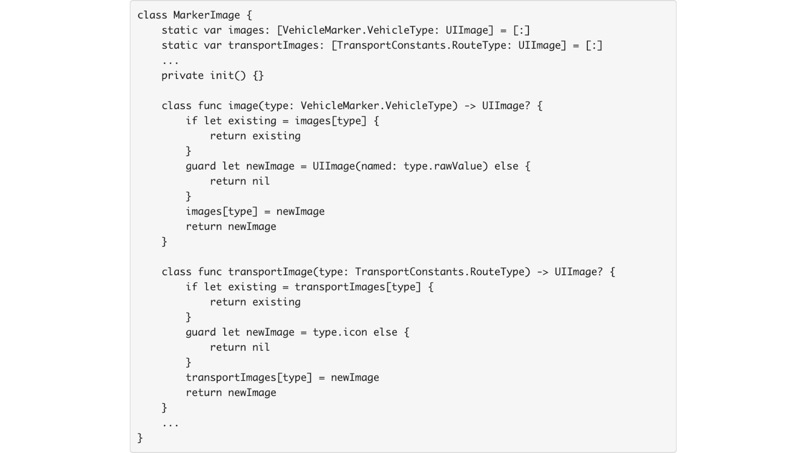
The one we came up with consists of two parts. First, since we added a picture to each marker to represent the vehicle type, we optimized the UI_Image number. Previously, UI_Image was created for each marker, but now, instead of creating UI_Image each time we used a class with static variables of the dictionary type where the key is the type of transport ([VehicleType: UI_Image]), if an image of a required type is not in that dictionary when we request it a new image is created, saved to the dictionary, and returned. Otherwise, the existing one is returned.
This is illustrated in the code snippet below:

The second step was to optimize the number of markers on the vehicle tracking map. Previously, we drew all the markers in the region (city). Instead, we changed this to display vehicle markers that are on the visible part of the map with some margin only. See below:

This solved the memory consumption issue and significantly improved application responsiveness.
Finding a solution to vehicle movement on the map
A vehicle tracking mobile app is not able to provide a 100% precise transport location in real time, but users still expect smooth movement of vehicles on the map. Each developer solves this problem with their own algorithms and approximations to make the markers’ movement more realistic within their application.
The app we built requests vehicle geo-coordinates every five seconds from the server if the zoom level of the map is maximal. If we decrease the interval, to smooth out a vehicle’s movement on the map, it would have put a high load on the server. Because of this five second delay, the transport’s movement was less than smooth.
To ensure the mobile client would not be overloaded with calculations, we decided to solve this problem on the backend. We changed the code so that when the server returns the next coordinates on our request, it also returns an array of five elements, which are the next coordinates obtained by route points interpolation. The mobile client, in turn, uses these coordinates between requests allowing the transport to move smoothly across the map.
RAM Overload
After adding more geographical regions to the app, the data flow expanded significantly. Switching between regions meant more requests for data required for the application to run in the specific area. Even the slightest intersection of neighboring regions initiated requests for new data.
Because processing the data is resource-intensive in itself, any additional instance of switching between regions, be it intentional or accidental, complicated and burdened the process with queues of uncompleted operations. Redundant objects in memory wasted resources, slowed down the application, and impaired the user experience.
After a detailed analysis of the request system, the solution turned out quite simple – new objects should not start loading and being processed before the previous ones complete their processing cycle. Therefore each new data request becomes clear and consistent thus optimizing the RAM and improving the performance and responsiveness of the applications. The solution was also crucial to enhance the user experience.
Creating a streamlined and effective user onboarding process of vehicle tracking app
Now that you’ve got your app working as you’d like, you need to get people to use it the way it was designed to be used. This is where user onboarding comes in. User onboarding is the system of actively guiding users to find new, and existing, value in your product. Through your app’s onboarding process, you can ensure that your users are successful when adopting your product for the first time.
Ideally, there is a stickiness to this process and users will want to return to your product time and time again. The faster a user is able to see your proposal’s value, the more you’ll be able to reduce your churn factor and customer acquisition costs. It doesn’t matter how great and easy to use your product is if you have a messy and cumbersome onboarding process.
What makes for a good onboarding process?
A quality onboarding process should not just teach a user how to use your app. It needs to make them feel valued. They need a warm welcome with a perfectly modulated learning curve. You want to curate your onboarding flow so that users can explore freely while learning the necessities.
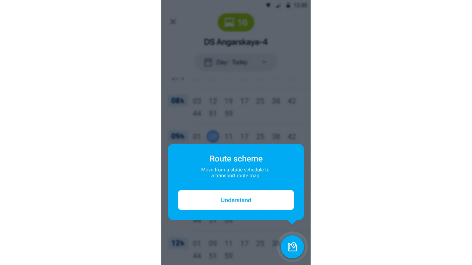
We’ve found that product tours or checklists can be helpful, especially for first-time users. Tours, using a series of windows or steps that appear in the user interface, allow you to show the basic elements of your application. These can range from highlighting the general layout to walking users through the most important actions that need to be taken when setting up a product. In our product tour for our Transportation app, for example, we start with the Route Scheme button.

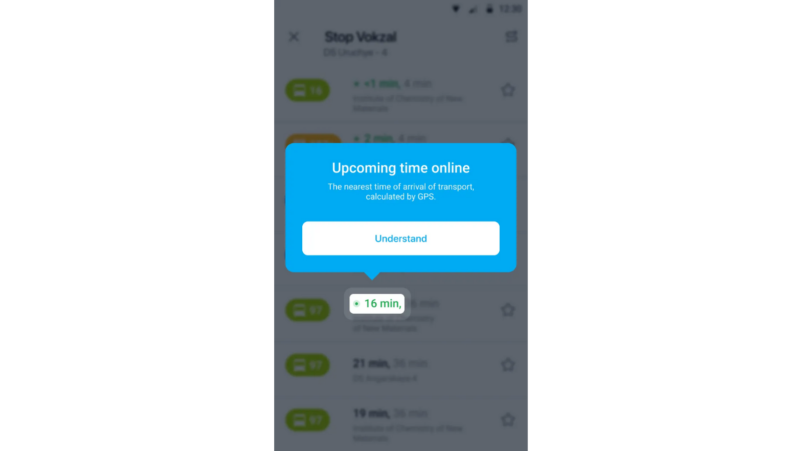
This button is really important as with it a user can move from the static schedule of a vehicle to its graphical route scheme. Without this hint, a user might completely miss this feature. Then there’s our arrival time indication hint.

Showing the real time of a vehicle’s arrival from GPS trackers is the essential feature of our application. It distinguishes us from our rivals and we want to make sure that our users know about it.
Overall, we can think of the onboarding process formula as way to nudge users to take action via:
- the right content,
- in the right channel, and
- at the right time.
Nailing the content, timing, and channel of your user onboarding, will take you much further than just good UX will. A quality product tour will help you retain and delight your user base, prevent churn, and will help customers see your product’s value as quickly as possible. You and your team put the time in to make a fantastic application, so make sure users are able to experience what you’ve built as you intend it.
Final Results
It is time to take stock of a long and exciting journey of developing the transport application.
Our team had to deal with several big challenges:
- Organizational: we had to establish excellent team interaction enhanced with the modern automation tools.
- Technical: we had the task to ensure a smooth and comfortable display of vehicles on the map, reduce the burden for system components and mobile devices without losing quality while using advanced development technologies.
- Marketing: the challenge was to safeguard the competitiveness of the system by letting the user have the real-time display of all relevant transport data thus increasing their overall satisfaction with the app.
By successfully solving these challenges our team developed a high-end vehicle tracking app that meets the users’ requirements and solves their problems. The application is scalable and has a convenient support system, great stability, performance, and usage. Subsequently, the application has been expanded to more countries and regions. Finally, we increased dramatically the level of expertise in transport and related technologies.
If you’re building a transportation or delivery or logistics app that uses maps and you need some help, don’t hesitate to reach out. We’re happy to create a solution just for you.
YOU MAY ALSO BE INTERESTED IN
- Ten Advanced Checks You Need to Get a High-Quality and User-Friendly Mobile App
- QA or not QA? Why Quality Assurance is so Important for the Success of Your Mobile Application
- Creating Your Mobile Business App: Costs, Team, Outsourcing
- A Story of Success: Mobile App Development for a Major Client in Logistics
- What You Need To Develop a High Quality Transportation App
- Building a Terrific Team to Create a Mobile Application
- An App That Matters: Getting Great Results with A/B Testing
- Flutter vs. Native: an Examination of Cross-Platform Mobile Development
Leave your contact information
Error: Contact form not found.